EX University
A six-semester architecture for life after divorce.
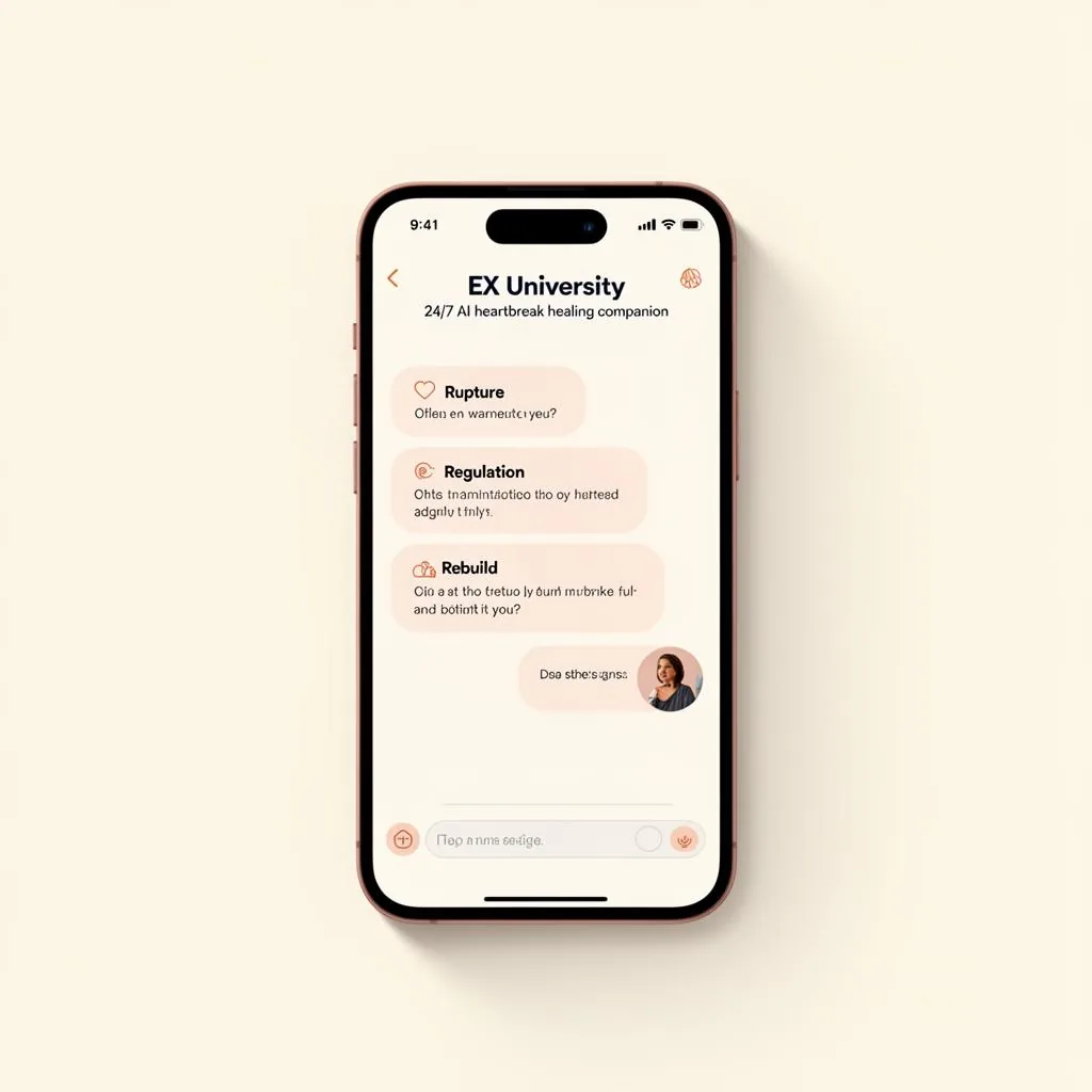
Divorce and relationship trauma do not resolve on a content calendar. The category was crowded with two extremes: clinical language that felt cold and inaccessible to someone in acute crisis, and soft self-help messaging that offered comfort without structure. Neither gave a person in the middle of a life transition a sense of where they were or what came next. EX University had a proprietary six-semester curriculum with real depth, but the brand around it read like a course catalog. Prospective members could not tell whether they were buying therapy, coaching, community, or education, and the ambiguity showed up as hesitation at exactly the moment when trust matters most. There was a second problem underneath the first. The curriculum was linear and cumulative, but the digital experience presented it as a flat menu. Someone arriving in week one saw the same undifferentiated wall of material as someone finishing semester five. Progress was invisible, which made the work feel endless. In a category where people quietly drop out rather than complain, invisible progress is the single most expensive design flaw.
We treated the curriculum as the brand. The six-semester architecture became the organizing metaphor for everything: navigation, visual system, marketing narrative, and onboarding. Framing the work as semesters rather than modules did something the copy alone could not. It told a person in crisis that there was a defined path, a beginning and an end, and other people walking it at the same time. Academic structure carried authority without clinical distance. The identity system paired a grounded editorial typographic voice with a warm, restrained palette, deliberately avoiding both the pastel softness of the wellness category and the sterile blues of clinical branding. Every screen answers three questions immediately: where am I, what is this semester for, and what is the next action. Progress indicators are always visible, so completed work accumulates into evidence rather than disappearing behind a checkmark. The platform experience was built around the emotional arc, not just the information architecture. Early semesters lower the cost of entry with short, finishable units. Later semesters open into longer reflective work once the habit is established. Community touchpoints were placed at the transitions between semesters, where drop-off risk is highest. Marketing collateral, landing pages, and the enrollment flow all reuse the same semester language, so the promise made in an ad is the exact structure a member finds after signing up.
What we shipped.
- 01Full brand identity system: typography, palette, and editorial voice
- 02Six-semester curriculum architecture translated into navigation and IA
- 03Platform experience design with always-visible progress indicators
- 04Onboarding and enrollment flow aligned to the semester narrative
- 05Marketing site, landing pages, and campaign collateral system
- 06Community touchpoints placed at semester transitions
What it moved.
- Curriculum depth made legible in the first thirty seconds of a visit
- A defined path replaced open-ended browsing for members in crisis
- Consistent semester language from first ad impression through enrollment
- Brand positioned between clinical authority and human warmth
- Product strategy
- Mobile architecture
- Curriculum engineering
- Supabase
- Capacitor
- React
From our venture lab: see BedFlow, the census-aware CRM we built for treatment centers.
Visit the EX University
platform.
Go to ex-university.com→A six-semester architecture for life after divorce. Now live on iOS, Android, and web.